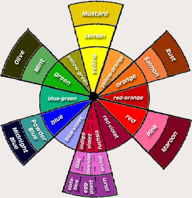
Anyone who knows me knows that I cant be satisfied with a generic design. I pretty much customize everything I own and my blog is no different! I designed my header with photoshop and fussed with the colors on my page to create the perfect combination using this handy html color tool. I encourage you to get creative with your own blog and if you need any help or are looking for suggestions, I’d be happy to help. These two colors (or variations of them) are my favorite colors. They are all over my house and my wardrobe! Do you know that they look best paired together because they are opposite on the color wheel? Use this as a rule of thumb when decorating! You can always step right or left to your main opposing color and achieve harmony in a space. Example (use the color wheel below as your visual): if you are using green, you can step to either side of red to choose a complimentary color. Choose to pair your green with either orange or violet and anything in between to create something appealing to the eye.

I found this great decorator’s color wheel which carries the colors you would most likely choose for a home.

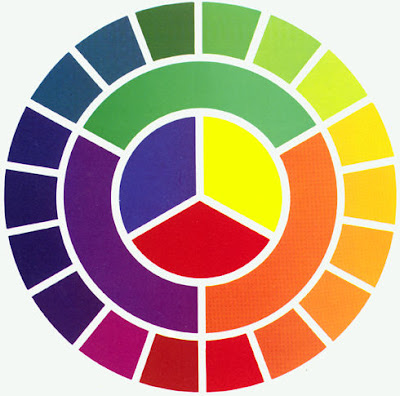
The publisher also included these color design basics:
- In the center are the primary colors – Red, Yellow, and Blue. From these, all others are made.
- In the inner ring are secondary colors – orange, green, violet, made by mixing equal amounts of primary colors. Mix red and yellow for orange, mix red and blue for violet, and mix blue and yellow for green.
- In the outer ring are the tertiary colors – achieved by mixing varying amounts of one primary color with the adjacent primary.
- Mix a large amount of red with a small amount of blue and you will get a red-violet color. Do the opposite for blue-violet. Increase or decrease amounts form many hues in between.
There’s your color design lesson of the day!


